
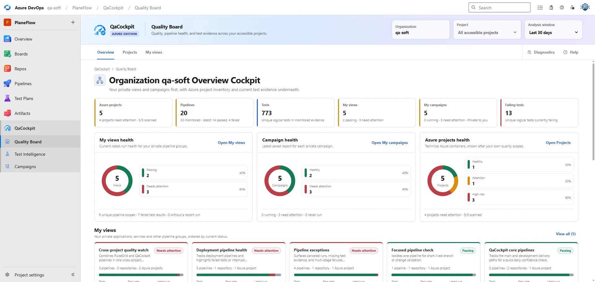
An Azure DevOps quality dashboard should help an Engineering Manager, QA Lead, Head of Engineering, or Test Manager decide where attention is needed. It should not be a gallery of charts detached from the pipelines, tests, and evidence that created them.
The useful question is not “How many tests passed?” It is:
What can we conclude about quality across the projects and release work we intended to validate?
Begin with project health
An organization may contain several Azure DevOps projects with different automation, cadence, and risk. The first view should preserve those boundaries.
A project-health matrix or distribution can show:
- healthy projects with current, complete evidence
- projects needing attention because of controlled failures or gaps
- high-risk projects with new failures or pipeline errors
- projects with stale evidence
- projects still collecting a release regression
- projects whose required sources have never reported
The state must be explainable. A user should be able to select a project and see which source, failure, missing report, or freshness rule produced it.
Show pipelines as Test Sources, not a flat run feed
A raw list of recent Azure Pipeline runs mixes unrelated work with release-critical evidence. A Test Source gives each relevant automation stream a stable business purpose.
For every source, show:
- repository and pipeline identity where appropriate
- latest relevant execution and attempt
- current pipeline lifecycle
- structured-result intake state
- test outcome
- evidence freshness
- expected-versus-observed scope
- direct path to failures and diagnostics
The dashboard should distinguish not required for this release from required but missing. Without that distinction, more pipeline activity creates more noise rather than
more confidence.
Make missing evidence visible
Missing evidence is not the same as a pass, a failure, or zero tests. It can mean the pipeline never ran, the test command was skipped, result publication failed, a shard was absent, or the extension could not read the expected result.
Useful dashboard states include:
- awaiting execution
- pipeline in progress
- results expected
- partial report
- invalid report
- inaccessible evidence
- complete report
This keeps a green pipeline from hiding an empty test signal and gives the operator a concrete troubleshooting starting point.
Put current failures in operating context
A failure total is not an inbox. The dashboard should show whether failures are new, unclassified, recurring, owned, accepted, or resolved according to behavior the product actually supports.
For a manager, useful context includes:
- projects and sources affected
- number of active clusters rather than duplicated occurrences
- impact on the current release or Campaign
- age and recurrence
- ownership or investigation status
- direct drill-down for engineering diagnosis
For an engineer, the next view should contain the exact test, attempt, failure message, stack trace, safe logs, and retained diagnostics. The dashboard is valuable only when it shortens that path.
Include freshness beside pass rate
Pass rate without freshness can reward an old result. A dashboard should show when each source last produced complete evidence and whether that age matches its expected cadence.
This also improves trend interpretation. If pass rate rises while fewer tests or sources report, the apparent improvement may be a shrinking denominator. Compare the rate with:
- reported test count
- expected scope
- source completeness
- number of failed and error outcomes
- evidence age
- retries and attempts
Read more about pass rate hiding absolute failures and test scope drift.
Represent release and regression state
Project health is rolling operational context. A Campaign is a fixed regression or release collection. A quality dashboard should expose both without conflating them.
A broader dashboard design can track stage progress, release context and expected scope. In QaCockpit for Azure DevOps, My campaigns tracks user-selected sources and exact executions for personal reports. Pipeline stage execution remains in Azure DevOps, and source completeness does not establish an expected-test baseline or automatically approve a release.
When designing a more complete regression view, consider:
- required Test Sources
- stage and source progress
- reported, partial, missing, and failed evidence
- attempt history
- fixed environment, branch, commit, and release context
- the combined report generated from that evidence
A stakeholder should not have to infer release readiness from whichever pipeline ran last. The Campaign should define what was required and whether the collection is complete.
Every visualization needs an action
Before adding a chart, write down what selecting it does.
Examples:
| Visualization | Useful action |
|---|---|
| Projects by health | Filter the matrix to the selected state |
| Health trend | List the projects represented by a historical segment |
| Top failing source/repository | Open Failure Inbox in the right project/source context |
| Evidence freshness | Open the stale or never-reported Test Sources |
| Campaign completeness | Open the missing or partial source in the fixed run |
If the chart cannot lead to evidence or a decision, a compact table or sentence may be better.
Pass rate is not release readiness
Pass rate describes observed test outcomes. Release readiness is a broader evidence question that includes required sources, scope completeness, freshness, failures, environment, and the release context itself.
That does not mean a dashboard should invent a magic readiness score. It should expose the facts needed for a defensible decision:
- what was required
- what ran
- what reported
- what passed or failed
- what is missing or stale
- what needs an owner or next action
The result is a cockpit, not a scoreboard: managers see where to focus, and engineers can drill into the exact Azure DevOps evidence behind the signal.
Explore Quality Board Overview and Project Cockpit documentation.